Picture a farmers' market on a Saturday morning. One end of the square is lined with farmers who have trucked in bushels of wheat; the other end is full of shoppers who bake bread, feed animals, or mill flour. Nobody is in charge. No committee met the night before to decree a price, and no one counted exactly how much wheat the town needs. And yet, by the end of the morning, the wheat sells at one fairly steady price, and nearly every bushel that came to market finds a buyer. That quiet regularity — order emerging with nobody ordering it — is what this topic explains.
The two sides of the market want opposite things. Buyers would love the price to be low; every shopper would rather pay $8 a bushel than $16. Sellers would love it to be high; every farmer would rather receive $16 than $8. Neither side gets to dictate. What each side can do is decide how much to buy or sell at whatever price is on offer — and those decisions, added up across hundreds of people, turn out to be extraordinarily well-behaved.
Start with the buyers. Ask each shopper: "If the price were $10 a bushel, how many would you take home? What if it were $12? Or $20?" Add up everyone's answers and you get a quantity demanded for each possible price — the total amount buyers collectively want at that price. The pattern is as close to a law as economics has: at higher prices, buyers want less (some switch to oats or corn, some bake less often), and at lower prices, they want more. Plot quantity demanded against price and you get a demand curve, and it slopes downward. That slope is not a decoration — it is a literal record of buyers walking away as the price climbs and coming back as it falls.
Now the sellers. Ask each farmer: "At what price is it worth trucking wheat to town?" At low prices, only farmers with cheap transport and good harvests bother; at high prices, farmers with higher costs find the trip suddenly worthwhile, and everyone is willing to bring more. Add up their answers and you get a quantity supplied for each possible price. It rises with the price — plot it and you get an upward-sloping supply curve, a record of sellers being coaxed into the market as the reward grows.
So the market contains two crowd-sized preferences pulling in opposite directions, and the genuinely interesting question is: what actually happens when they meet? Is there a price where the amount buyers want exactly matches the amount sellers bring — and if so, can we find it precisely, and predict how it moves when the world changes? The rest of this topic answers that with nothing more than solving one linear equation — carefully, and in full.
What "equilibrium" actually means
Before any algebra, it helps to know what the destination is and why it deserves a special name. An equilibrium is a price at which quantity demanded and quantity supplied are equal — every buyer who wants wheat at that price finds a seller, and every seller who brought wheat at that price finds a buyer. Nothing is left over, and nobody goes home empty-handed. Economists call it an equilibrium because, once the market reaches it, nobody has any reason to change their behavior: no buyer is frustrated enough to offer more, no seller is stuck with unsold wheat and tempted to accept less. The price just sits there.
To see why every other price is unstable, put concrete numbers on the two sides. Suppose the weekly wheat market works like this (we'll derive these curves properly in the next section): if the price stood at $8 a bushel, buyers would want 68 thousand bushels but farmers would bring only 28 thousand. There is a shortage of 40 thousand bushels — forty thousand bushels' worth of shoppers going home without wheat. What happens next is not mysterious: frustrated buyers start offering a little more rather than leave empty-handed, and sellers, noticing the crowd, realize they can charge more and still sell out. The price gets pushed up.
Suppose instead the price stood at $16. Now buyers want only 36 thousand bushels while farmers bring 76 thousand — a surplus of 40 thousand bushels sitting unsold on the tables as the afternoon wears on. Sellers with wheat left over start accepting slightly less rather than truck it home, and buyers notice they can haggle. The price gets pushed down.
In plain words: any price below the crossing point creates a shortage that bids the price up, and any price above it creates a surplus that presses the price down. Only at the crossing itself do the pushes cancel. That's why the crossing point matters — it's not just a spot on a graph, it's the only resting place the market has.
Two curves for one market
Now make the two sides of this market precise. Throughout this track, counts thousands of bushels per week — the wheat the whole county trades, not one stall's morning. Each curve is just the answer to the interview questions from the hook, compressed into one line of algebra. For the buyers of this wheat market:
Read that as: if wheat were free, the county would take 100 thousand bushels a week, and every dollar added to the price costs the market 4 thousand bushels of demand — a few buyers switch to other grains or bake less with each step up. (At , demand hits zero: twenty-five dollars is the price at which the last buyer walks away.) For the farmers:
Concretely: below about $3.33 a bushel ( makes ), no farmer finds the trip worthwhile at all; above that threshold, every dollar added to the price coaxes 6 thousand more bushels out of the fields and onto the tables. The negative intercept looks odd but means something real — supply doesn't even start until the price clears the cheapest farmer's costs. Neither of these numbers is plucked from nowhere; each is exactly what you'd get by tallying the buyer and seller interviews described above.
Solving for the equilibrium
Equilibrium means the quantity buyers want equals the quantity sellers bring — a single price where both interviews agree. So set the two expressions equal and solve, step by step:
Add to both sides, then add to both sides:
Now substitute back into demand to get the quantity:
A solution isn't finished until it's checked against the side you didn't use. Supply at gives — the same number, as it must be. Put plainly: this market settles at $12 a bushel, with 52 thousand bushels changing hands each week, and at that price there is neither a single unsold bushel nor a single unfilled buyer. Also notice this is consistent with the off-equilibrium stories above: $8 is below $12 and produced a shortage; $16 is above and produced a surplus. The pushes both point at $12.
A useful check: the general formula
The wheat numbers are one instance of a pattern worth deriving once for all linear markets. Take any demand curve and any supply curve , with (demand slopes down) and (supply slopes up). Setting them equal:
What that says: the equilibrium price is the gap between the two intercepts — how much more buyers want at zero price than sellers offer, — divided by the sum of the two slopes, which measures how quickly the two sides close that gap as the price rises by a dollar. The equilibrium quantity follows by substituting back:
Now the check: the wheat market has , , , . Then
Both match the step-by-step solution exactly — two independent routes to the same answer, which is what "the algebra is right" looks like.
When demand shifts: a rise in income
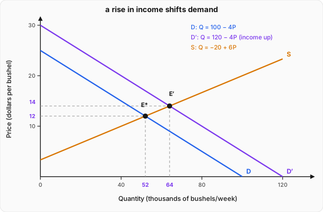
An equilibrium is only as permanent as the conditions behind the curves. Suppose the town gets richer — a factory opens, paychecks rise — and bread is the kind of good people buy more of when they have more to spend. At every price, buyers now want 20 thousand more bushels a week than before. The demand curve becomes
same slope as before — buyers are just as price-sensitive — but a higher intercept: the whole schedule of wants has shifted up by 20.
Before solving anything, predict what must happen. At the old price of $12, buyers now want bushels, but sellers still bring only 52. That's a shortage of 20 thousand bushels — and we already know what shortages do: they bid the price up. As the price rises, two things happen at once: buyers trim back along their new demand curve, and sellers bring more along their unchanged supply curve. The market slides to a new crossing:
Check with supply: . Matches. The price rose from $12 to $14, and the quantity traded rose from 52 to 64 thousand bushels. Both moved up. Notice the mechanics carefully, because this is the part everyone gets wrong at first: the supply curve itself never moved — farmers' costs and willingness are exactly what they were. What changed is where on that fixed curve the market sits. A demand-side shift pushes the equilibrium along the supply curve, and since the supply curve slopes up, the new resting point has both a higher price and a higher quantity. You could have predicted the direction of both changes with no algebra at all — the algebra only tells you how far.
One warning before the picture, because it trips up nearly everyone the first time: economics plots price on the vertical axis and quantity on the horizontal axis, even though the algebra above treats quantity as the variable that depends on price . If this were a math class, would go on the horizontal axis. The convention is over a century old and too entrenched to fight, so just remember when reading the curves that each line shows "price on the vertical, quantity on the horizontal" — the demand line hits the vertical axis at (the walk-away price) and the shifted demand line at .
Worked example
A bad harvest hits the region: at every price, farmers can now bring 10 thousand fewer bushels per week, so supply shifts to . Demand is the original . Find the new equilibrium price and quantity, and compare them with the original equilibrium.
Step 1 — write down the two curves. Demand is unchanged: . The bad harvest subtracts 10 from whatever farmers supplied at each price: . Same slope as before — farmers respond to price exactly as they did — but a lower intercept: the whole supply schedule has shifted down by 10 thousand bushels.
Step 2 — predict before solving. At the old price of $12, sellers now bring bushels while buyers still want 52 — a shortage of 10. Expect the shortage to bid the price up, and expect quantity to fall this time, since the market will slide up the demand curve (which slopes down).
Step 3 — set the curves equal and solve for the price.
Step 4 — solve for the quantity. Using demand:
Step 5 — check against the other curve, then compare. New supply at : . Matches. Comparison with the original equilibrium: price rose from $12 to $13, and quantity fell from 52 to 48 — exactly the directions predicted in Step 2. Note the contrast with the demand shift in the body of this topic, which moved price and quantity in the same direction. A supply shift moves them in opposite directions, because the equilibrium now travels along the downward-sloping demand curve instead of the upward-sloping supply curve. As a final sanity check, the general formula gives — same answer, third route.
Where this leads
The two curves and one crossing point derived here do something remarkable: they take the independent, conflicting wishes of a whole crowd of buyers and sellers and compress them into a single prediction — this price, this quantity — plus a rule for how that prediction moves when the world shifts. But the shifts so far were treated as given: demand moved by 20 thousand bushels, supply by 10 thousand, and we never asked how much price responds to a shift of a given size, or what it is about buyers and sellers that makes that response large or small. That question — how strongly quantity reacts to price, and why it matters for everything from farm policy to tax burdens — has a name and a measure. It is the subject of the next topic: Elasticity and Its Applications.